Suzanne Collins's Website Re-Design & Case Study
Introduction
- Overview – Suzanne Collins is the author of The Hunger Games trilogy which is a popular dystopian young adult series.
- Challenge – To perform user research and conduct a suggested redesign.
- Approach – I used surveys and a heuristic evaluation to conduct tests to pinpoint weak areas on the website.
- Results – The end product is an improved and modern website based on user research.
The Process
The usability test and analysis were conducted to discover which areas of Suzanne Collins's website present usability issues and user difficulties.
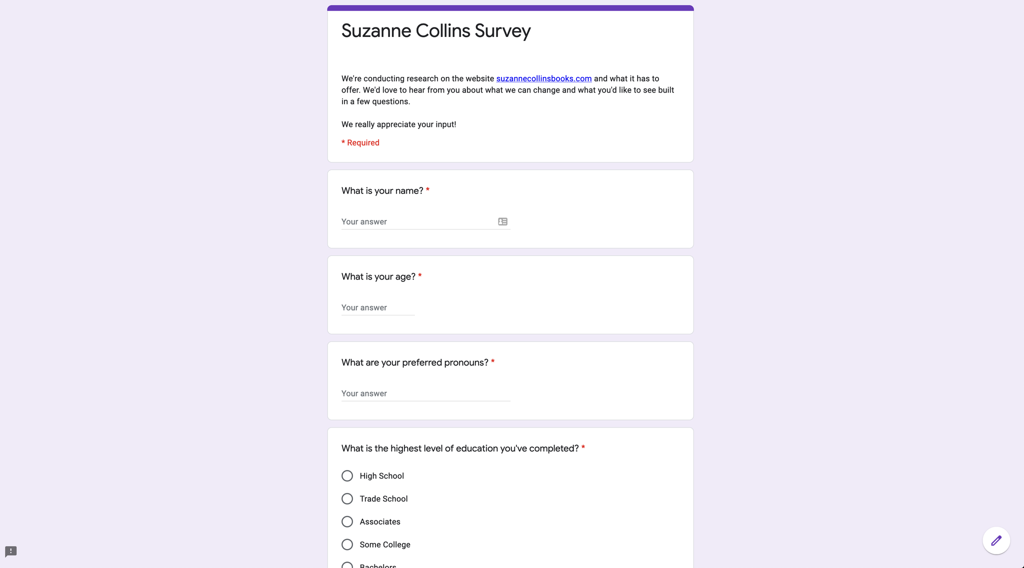
Both survey and observational data were used on six participants who completed a pre-test survey, a live three scenario, and six task test, and a post-test questionnaire.
The pre-test survey focused on gathering demographic data with seven multiple-choice questions. The results were quantified using statistical analysis. The data collected were observations, answers, whether the user completed the task or not, and the time taken with each task. Each test participant was presented with three scenarios and each scenario contained two tasks. Four pieces of data were recorded for each task. These include:
- Task completion or failure
- Task Completion time
- Navigational path taken
- Observational testimony by the tester
- Methodology
Task completion frequency and completion time were analyzed using statistical analysis. Navigational paths and observational testimony were used to identify trends across test participants. The questions were determined based on the initial heuristic evaluations and surveys. The primary usability issues of the website centered around the homepage, layout, and content quality. The scenarios were focused on identifying which areas on the website were confusing to navigate or had issues finding what they were looking for.
The Research
The significant issues found in the Heuristic Evaluations were:
- Layout
- Navigation
- Content quality
The problems I encountered in the usability test were:
- Locating purchasing options
- Locating specific products
- Scan-ability issues and more
The user testing that I completed resulted in the following recommendations:
- Prominent colors for the links and text
- Better labeling for purchasing the books
- Relocation of purchase links to an area that is visible above the fold on every page
- List products on the works page in chronological order
- Reduce the testimonial and review text
- More aggressively chunk and layer body text, especially in the biography, to increase scan-ability
The Design Iterations
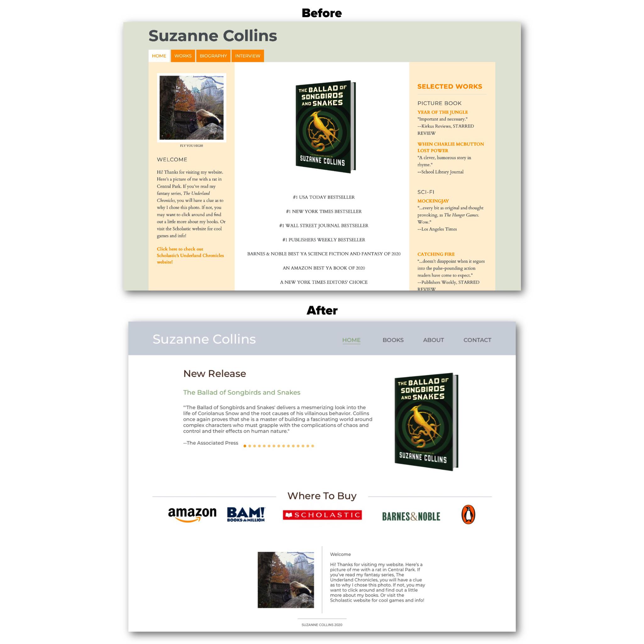
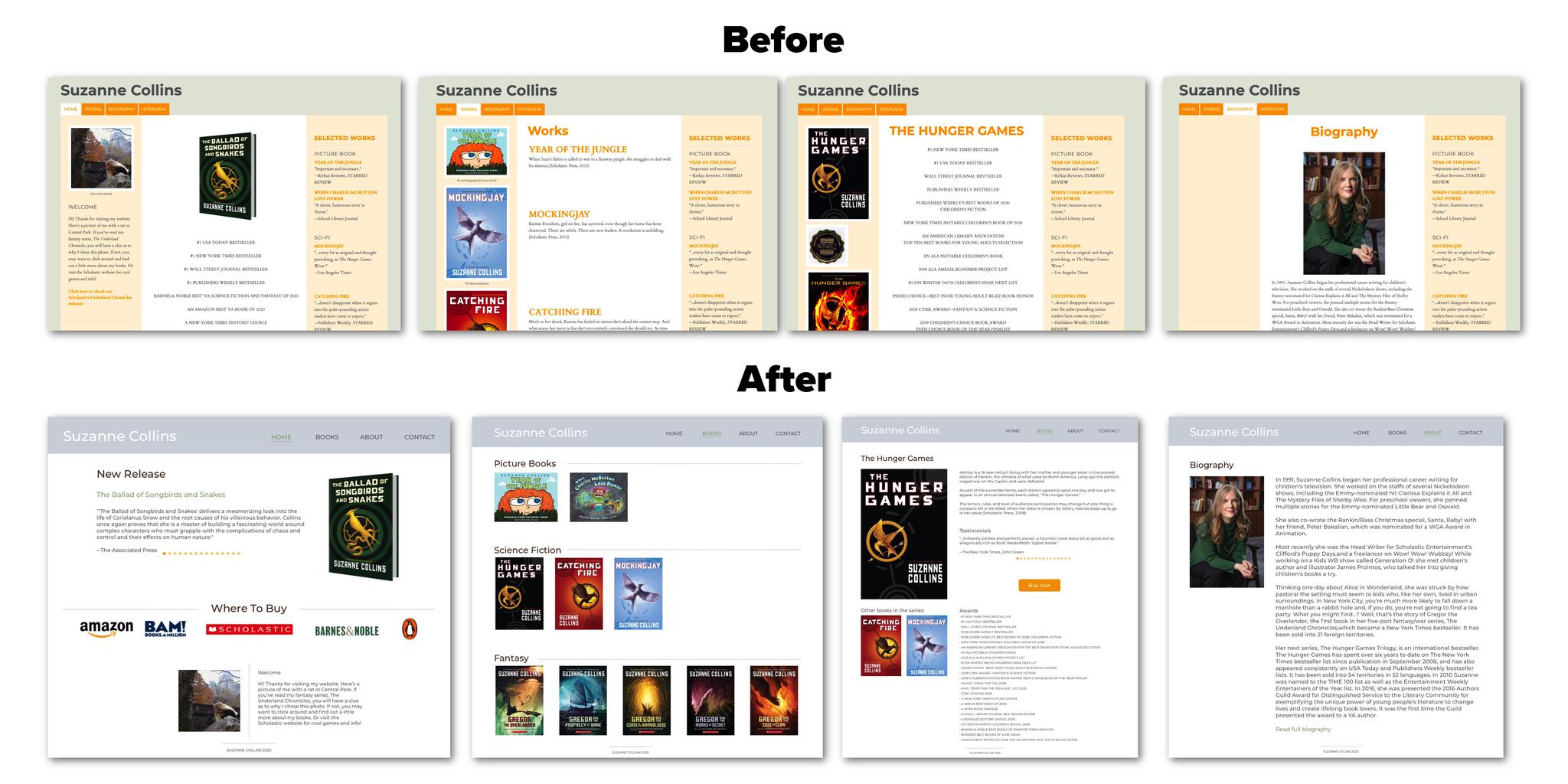
From the research, I worked on sketches and low fidelity wireframes to incorporate solutions to usability issues. Then I created a higher fidelity wireframe with the website fonts, colors, images, and navigation.
Overall, I made changes to the layout, fonts, colors, and content. Suzanne Collins’s website had two fronts: Montserrat, a sans-serif, and Cardo, a serif. To remove the feeling of clutter, I opted to keep only the sans-serif font for consistency. This is a result of the users having difficulty scanning for information on the site.
Many of the users were confused about what were links and what wasn’t. I used the current green and orange theme and expanded it into a four-color palette to remedy this. I ended up choosing grey, brown, green, and orange. The links are now green, and the buttons are orange.
I changed the navigation by taking out the less often used word “works” and “biography” and created “books” and “about” instead. I also added a contact tab, which results from many of the users wanting to reach out to Suzanne Collins or find a way to follow her. This page would have social media links and other ways to contact the author or find recent interviews.
The Results and Next Steps
Based on the research that was conducted, there are future items that can be added to Suzanne Collins's website such as:
- Character information
- Social media related news
- Newsletters
- Other ways to connect with the author and stay up-to-date
