Aprés's Error Page Microcopy
Error pages are the perfect way to delight the user instead of frustrating them. I like to mix human empathy with a great design for better usability, stronger branding, and a pleasing user experience.
Before:
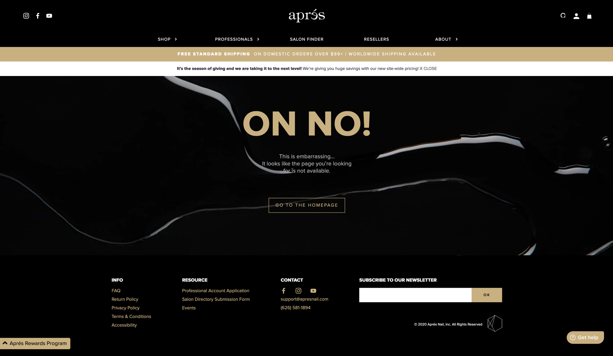
The before only has one option and prompts the user to go back to the homepage. It also lacks brand reinforcing and spells "on no" instead of "oh no."
After:
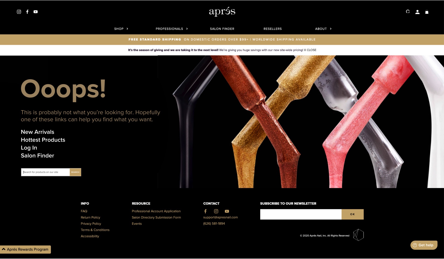
In this example, I've kept the error message but added more human empathy and options. Apres has many products, so a few popular links and a search bar can help users avoid the error page.
Goals for the solution:
- Suggest new arrivals
- Human empathy
- Open search bar
- Other popular page links
